Trend following is the oldest strategy in the book. Buy what's going up, sell what's going down. On average, it has made money for at least two centuries.
Around 2009, it stopped.
Not everywhere. Not at every speed. And the pattern of where it survived is the most interesting thing I've read this month.
In early July, Jean-Philippe Bouchaud, chairman of the quant fund CFM and co-author of the standard text on market microstructure, Trades, Quotes and Prices, put out a paper with three colleagues titled "Is Trend Still Your Friend?" They analyzed roughly 100 of the most liquid futures contracts from 1995 to 2025 and asked a simple question: trend clearly degraded after 2009, but did it degrade evenly?
It did not. And the variable that separates the markets where trend still pays from the markets where it's gone is not the one anyone would guess.
The autopsy everyone got wrong
Ask around why trend following stopped working and you get the same three answers. Too much money chasing it. Markets went electronic. The regime changed.
The paper tests all three and rejects all three: none of them fits the pattern of what died and what survived.
They are stories, not mechanisms. What the authors found instead is a mechanism, and it lives in the plumbing of the order book.
First, the part anyone can verify
Before we get to the mechanism, I wanted to check the basic claim myself. So I rebuilt their trend signal on 18 liquid futures with free daily data from 2000 to 2026: equity indices, FX, treasuries, energy, metals and grains.
The signal is exactly theirs, and it fits in a dozen lines: the difference between a fast and a slow exponential moving average, normalized by its own recent scale, clipped at plus-minus two standard deviations.
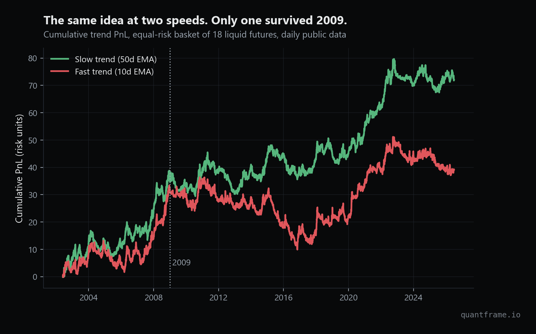
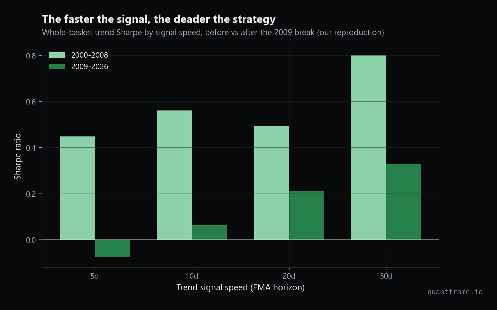
Run that at four speeds and split the sample at January 2009, and the picture is unambiguous.
Same basket, same idea, two speeds. The slow version kept compounding. The fast one never recovered its 2009 form.
The whole-basket Sharpe of the fastest signal I tested (5-day EMA) went from 0.45 before 2009 to slightly negative after. The 10-day version went from 0.56 to 0.06. The 50-day version fell from 0.80 to 0.33: a pay cut, but alive.
The staircase. The faster the signal, the harder 2009 hit; the 5-day version went negative.
The paper's own Table 1, on their bigger universe and longer sample, shows the same staircase: their fastest signal drops from a Sharpe of 0.84 to 0.12 after the break, while their slowest goes from 0.70 to 0.40. The faster the signal, the deader the strategy.
So far, so replicable. Here is where it gets strange.
One variable separates the dead from the living
The authors then asked what separates the degraded contracts from the surviving ones. It is none of the usual suspects.
It's tick size. Specifically, the minimum price increment of a contract divided by its daily volatility.
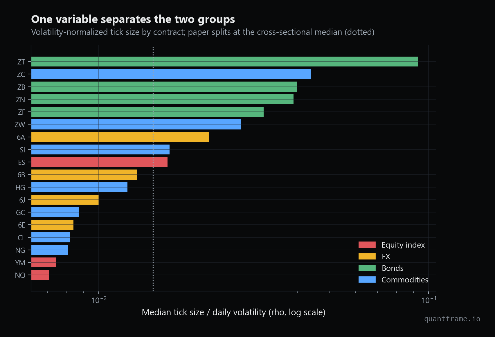
Every futures contract has a minimum increment its price can move: a tick. For the 10-year Treasury note future, one tick is about 1.6 hundredths of a point on a contract that moves maybe 40 hundredths a day. That is a coarse grid: a meaningful fraction of a typical day's range per tick.
For the Nasdaq future, a tick is a rounding error relative to its daily swings. Same exchange group, same kind of product, completely different granularity once you scale by volatility.
Rank contracts by this ratio and split at the median, and the universe falls into two groups: a large-tick tier (treasuries and most agricultural commodities) and a small-tick tier (most equity indices, most FX, energy and gold). I computed the ratio for my 18 contracts, and the clusters land broadly where the paper says they should: bonds and grains on the coarse side, equity indices, FX and energy on the fine side, with ES and silver sitting right at the boundary.
One public number per contract. Bonds and grains live on a coarse grid, indices and energy on a fine one. The dotted line is the median split.
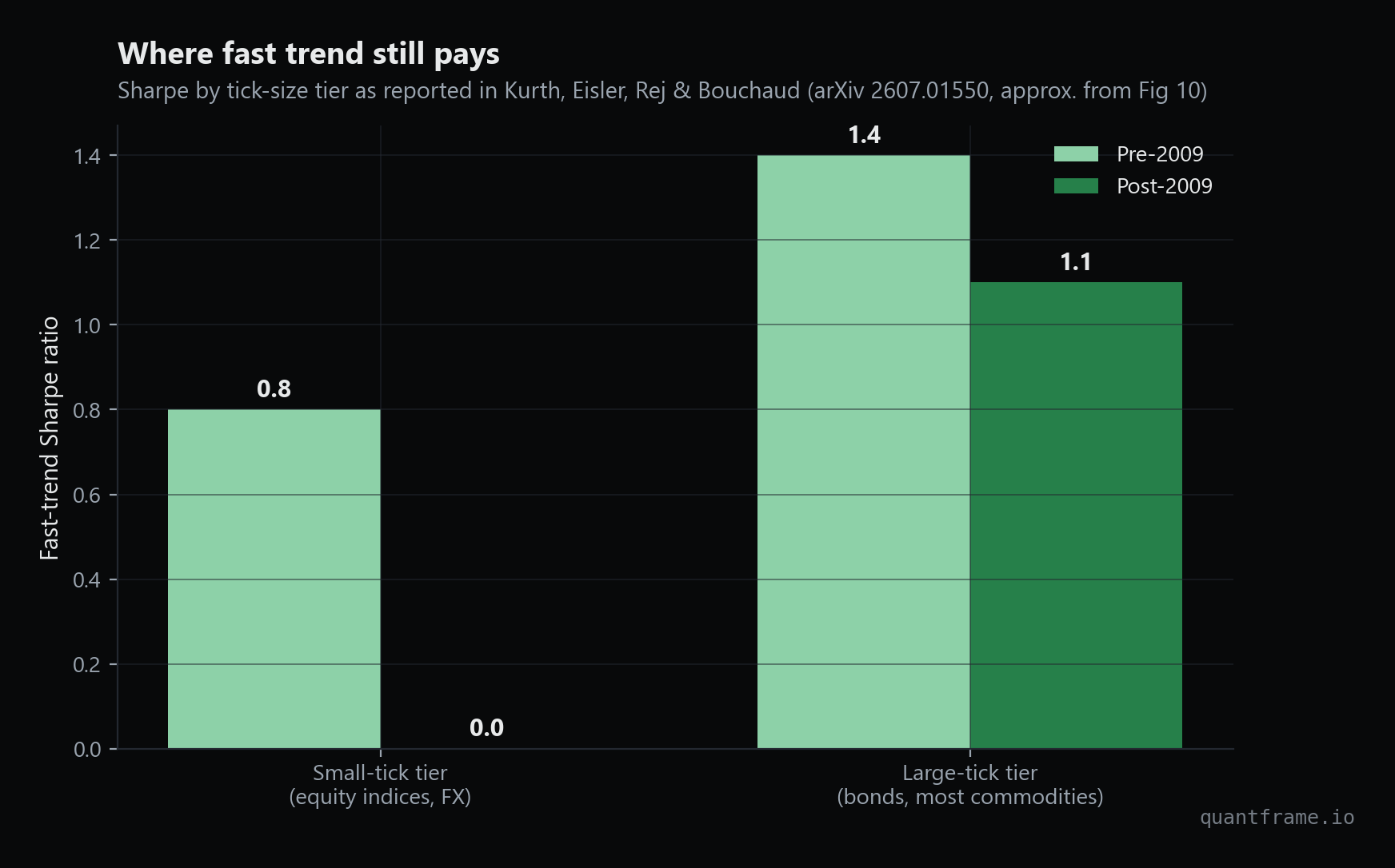
Now split the trend PnL by tier. On the paper's data, fast trend on small-tick contracts went from a Sharpe around 0.8 before 2009 to roughly zero after. On large-tick contracts it went from about 1.4 to about 1.1. One tier died. The other took a 20 to 30 percent haircut and kept paying.
The paper's numbers, redrawn. Small-tick fast trend went to zero. Large-tick kept a Sharpe above 1. Their data, not mine: see below for why.
That is not a subtle effect. The same signal, on the same exchanges, over the same years, is dead in one half of the futures universe and alive in the other. And the dividing line is a microstructure parameter most people building trend systems have never once looked at.
Trend was eating its own cooking
Why would tick size decide whether a price keeps trending? The authors' answer is where the paper earns its title.
Trend profits are partly self-fulfilling. A trend signal fires, funds buy, their market impact pushes the price up, which strengthens the signal, which triggers more buying. The strategy's own footprint reinforces the move that created it. For decades, this loop quietly subsidized every trend follower on earth.
The loop has a weak point: it needs someone on the other side absorbing the flow slowly enough for impact to build. That someone used to be slower liquidity providers.
Then the post-crisis order book changed. High-frequency market makers took over liquidity provision, and they are extremely good at one thing: recognizing predictable directional flow and getting out of its way. When a trend fund's buying is forecastable, an HFT desk does not stand there absorbing it. It pulls its quotes and re-posts higher.
Here is the catch: they can only do that on a fine price grid. On small-tick contracts there is always a price level one nearly-free tick away to retreat to, so depth evaporates in front of trend flow, impact stops accumulating, and the feedback loop dies. On large-tick contracts the grid is too coarse for that dance. Queues at each price level are deep, repricing is expensive, and the book still absorbs directional flow the old way. The loop survives.
The paper backs this with order book evidence: after roughly 2010, the correlation between trend-follower flow and book imbalance flipped sign on small-tick contracts, from about minus 3 percent to plus 4 percent annually, meaning liquidity started rotating against the trend rather than feeding it.
I have not seen this argument anywhere else, and it reframes what "alpha decay" means. The edge did not get arbitraged away by people copying the strategy. The market's plumbing changed, and the subsidy got switched off, one tick regime at a time.
The part I could not reproduce, and why that is the real lesson
I tried to reproduce the tier split with my free data. I failed, and the failure is instructive.
My naive attempt came out backwards: the large-tick basket looked worse after 2009, not better. The reason is buried in how free continuous futures series are built. Yahoo-style data splices contracts together at each quarterly roll without adjusting for the price gap between the old contract and the new one.
On a volatile contract that gap is noise. On a low-volatility contract it is enormous: my two-year Treasury note series has 51 daily moves exceeding four standard deviations since 2000, more than any other contract in my basket. A two-year note does not have 51 genuine four-sigma shocks in a quarter century. Those are roll gaps wearing a costume.
And here is the punchline: the single worst-contaminated series in my basket is exactly the kind of contract where trend still works, a low-volatility, large-tick treasury. The corner of the market where the strategy survives is the corner where free spliced data lies the most. If you have ever run a futures backtest on free continuous series and trusted the result, this is your warning.
What this means for you
1. Check the tick-to-volatility ratio of everything you trade. It is public information: the exchange publishes tick sizes, and volatility is one line of pandas. It costs nothing to compute and it now predicts whether an entire strategy class works on that instrument.
2. Signal speed is microstructure exposure. The slower your signal, the less your fate depends on order book games. Slow trend survived across the whole basket; fast trend only survived where the grid protected it. If you are running anything fast, you are not just betting on the signal, you are betting on the plumbing.
3. Edges die by mechanism, not by magic. "It stopped working" is not an explanation. The best quant research of the last few years, this paper included, treats a dead strategy as a body and finds the cause of death. If you cannot name the mechanism that pays you, you cannot know when it switches off.
4. Free data lies in structural ways. Roll gaps, splicing, survivorship: these are not random noise, they are systematic distortions that can invert a conclusion. Before trusting any futures backtest, count your four-sigma days. If a sleepy contract has dozens, you are backtesting the data vendor, not the market.
Try it yourself
Everything in my reproduction runs on a laptop with free daily data: the signal is nine lines of pandas, the tick-size table comes from the CME website, and the whole thing takes a minute to run. The paper is open on arXiv (2607.01550) and is unusually readable for microstructure work. Read the paper, rebuild the signal, and check your own markets against the tick-size line.
If you want the foundations to actually do this kind of work, from the stochastic calculus behind these models to the Python that runs them, that is exactly what QuantFrame teaches. Your roadmap is waiting.
End of entry
Found this useful?
Likes decide what gets written next.Sign in to like
QuantFrame
Liked this article?
QuantFrame teaches you the math, code, and projects to break into quant. Plus a personalized roadmap built for your background and goals.